To talk about intuitive design, let’s start with something counterintuitive: When she began as the product manager for Bio-Rad’s effort to create an entirely new chromatography system, Farah Mavandadi had little experience with biochromatography.
“I’d used chromatography to perform small molecule purification, but never protein purification. It’s quite different,” she says. “I was actually intimidated by the BioLogic DuoFlow™ system [the preceding Bio-Rad chromatography system]. I used to bring an R&D scientist with me whenever I had to go for trainings on that system, just so I wouldn’t get lost.”
In fact, dealing with such confusion has caused chromatography users all over the world to literally break down and sing the blues, as this video shows:
This researcher sings a tune many will recognize from their own frustrations with overly complex chromatography instruments. The NGC™ chromatography system offers a simple, user-friendly interface so even students with little experience will beat the “learning curve blues.”
Far from being a liability, however, Mavandadi’s lack of experience in biochromatography would turn into a major advantage in designing an entirely new system.
This installment of The Chromatography Chronicles investigates how Bio-Rad’s development team brought a seamless, intuitive user experience to the NGC chromatography system. This meant taking a fresh look at the assumptions built into biochromatography instruments and their interfaces. Mavandadi, because she didn’t know what was “mainstream” in biochromatography, turned out to be in an ideal position to challenge these assumptions, drawing upon her experience as a user of flash chromatography.
“I wanted to make the NGC chromatography system as simple as possible, so I could use it myself,” says Mavandadi. “Especially on the software side, I played the role of making it easy for the new user, because if I could use it, anyone could use it!”

The NGC chromatography system’s ChromLab™ software makes experiments and flow paths visual, allowing for easy and intuitive design and control of purification schemes.
She had noticed how, on other systems’ software, designing an experiment still required writing down quantities and sketching out the purification scheme alongside the software, rather than through it. “I’m a very visual person, so I wanted to see the experiment as I was programming it,” she says. That was the kind of simple, almost obvious request that resulted in one important upgrade for users — the ability in the NGC chromatography system’s ChromLab™ software to visualize their gradients as they designed them, dragging and dropping the gradient graph, for example, to control buffer concentrations and run durations.
With its modular design [link to NGC 3], the NGC chromatography system makes it easy to add and change components. These changes are instantly reflected by the software, which recognizes them and maps them to the fluidic scheme, and are controllable through either the instrument’s touch screen or a computer. Once new or different modules come in, plumbing the system — often a major pain point for nonexperts — now has a visual dimension in both software and hardware.
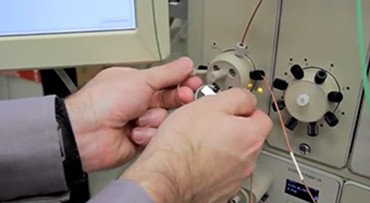
“There are ‘Point-to-Plumb™’ LEDs on the modules that provide you with guiding lights in figuring out what connects to what when plumbing,” Mavandadi says. “This is especially important in translating the fluidic scheme, which is a linear path, into the hardware. So it’s as simple as possible: you click on the connection you want to make and lights light up on the hardware ports to tell you, ‘plumb this to this.’”


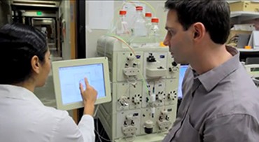
Left: Chris Fraser, a molecular biologist at UC Davis, connects tubing using Point-to-Plumb LEDs, which light up at connection points for quick plumbing of the NGC chromatography system. Right: Fraser and a grad student design a method using the system’s touch screen controller.
Even buying an NGC chromatography system reflects this intuitive design approach, with an award-winning app [link] helping customers review and design their systems. Given that more than 3,000 different possible hardware configurations exist, simplifying the process is no small feat. A “spinning wheel” design, based on slotting key components where they naturally fit, helps narrow down the options and reduce choice fatigue.
“If you’ve done a slot machine in Vegas, you can do this,” says Mavandadi.
Why not apply the visual approach found in today’s smartphones and tablets to a scientific instrument? Where other chromatography systems offer incremental improvements, the NGC chromatography system makes a leap that’s more akin to one of these disruptive mobile technologies. From graphical experiment design to intelligent mapping of modules to the fluidic scheme to light-up system plumbing, the NGC chromatography system is the result of continually asking “why not?” of the chromatography user experience.

